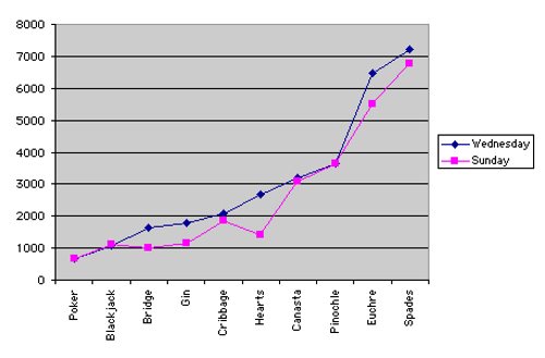
Line graphs are great if you have a continous x axis. Not here...
 source-link

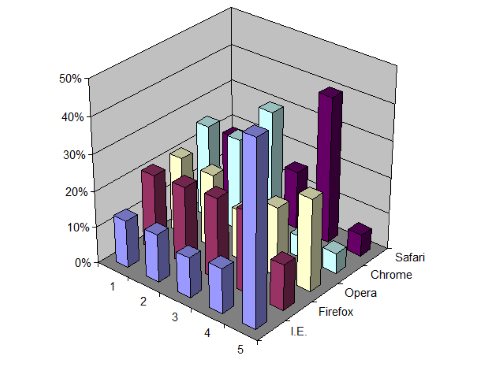
It is rarely a good idea to use 3D bar chart. It is never a good idea to use a 3D 3D bar chart. A simple 2D grid would work better.
 source-link
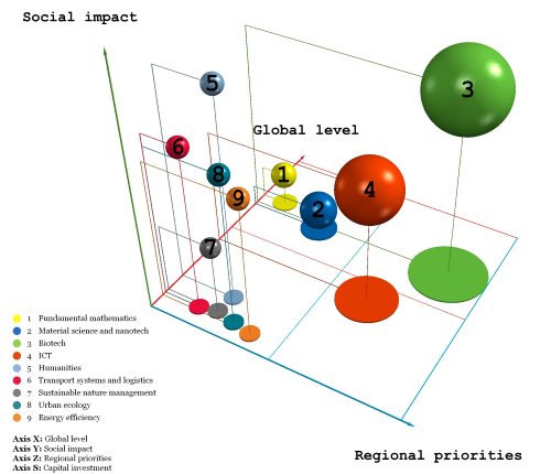
Another 3D chart! This time projected onto 2D.
And what is plotted on the x, y, z and s axes? Which axis is which?
Mind Blown!
 source-link
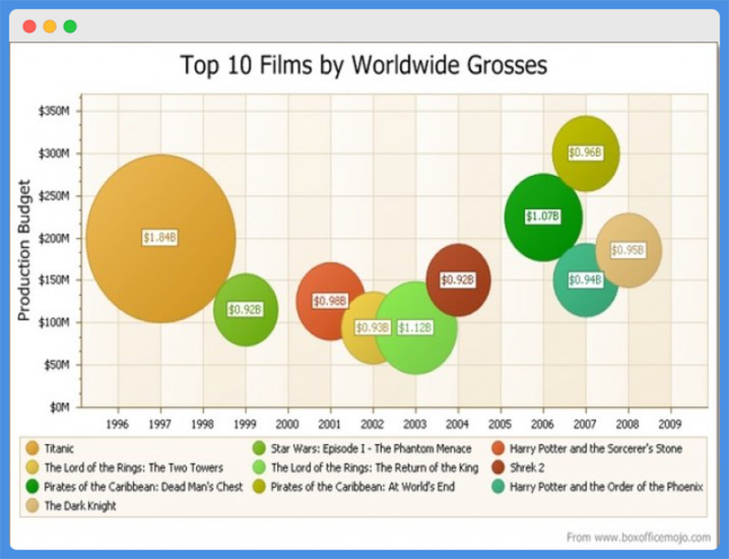
If we overlook the problems with colors and layout. People are not very good at comparing size of circles...
 source-link
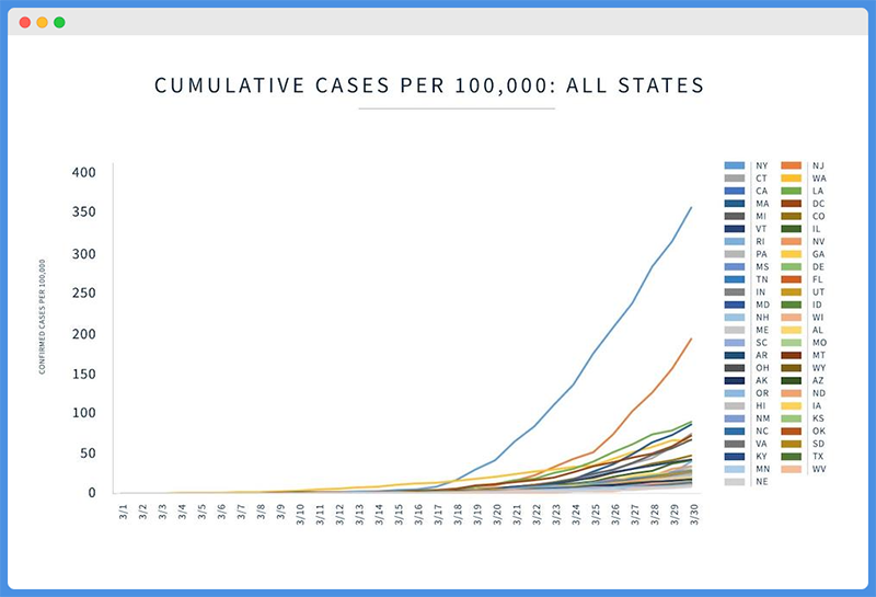
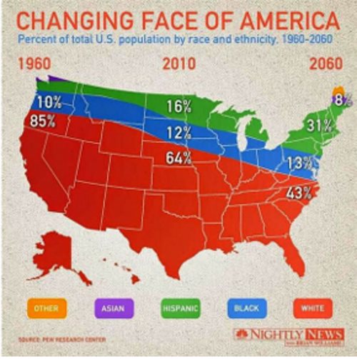
Ehmmmm, how many lines? Admittedly, this would work as an interactive visualisation if we could filter only states of interest.
 source-link
I struggle to think of a worse way to present data. Anything would be better here: barchart, line chart... In data visualisation less is often more.
 source-link
I struggle to think of a worse way to present data. Anything would be better here: barchart, line chart... In data visualisation less is often more.
 source-link
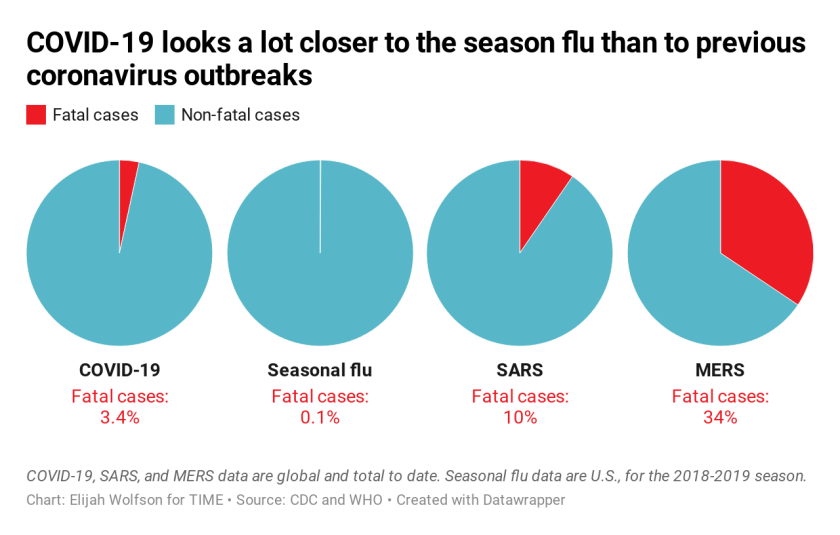
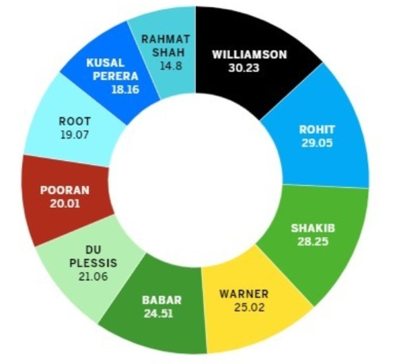
If we ignore the pie charts ( I hate pie charts!), the problem is the relative comparison accross diseases with vastly different base rates.
 source-link
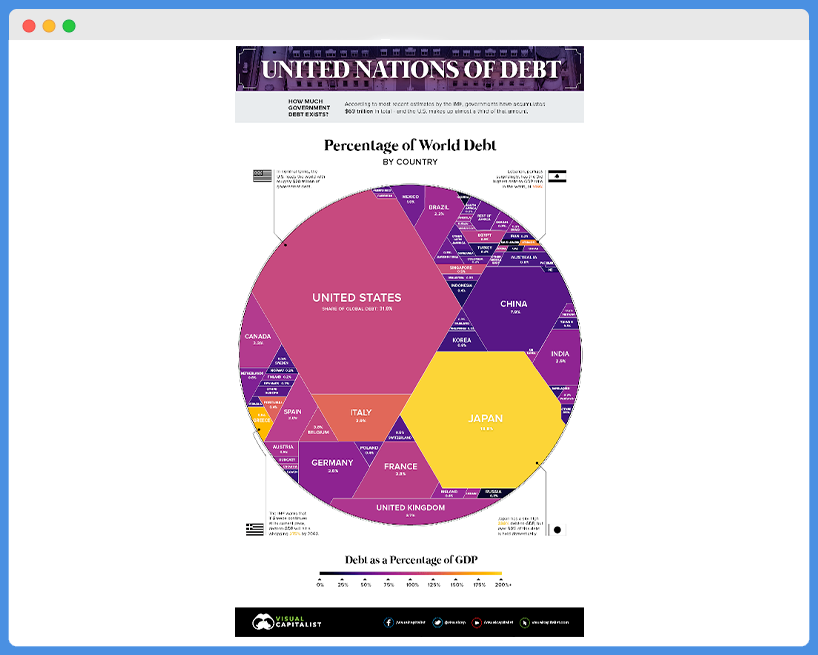
This graph illustrates how an attempt to be creative can prove costly. Interpreting angles is not a human forte.
 source-link
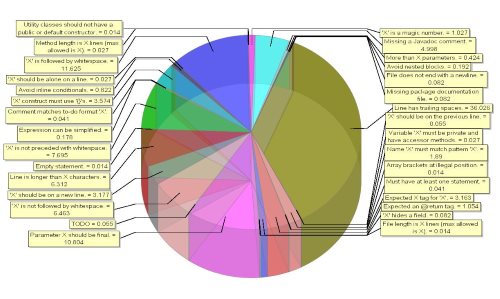
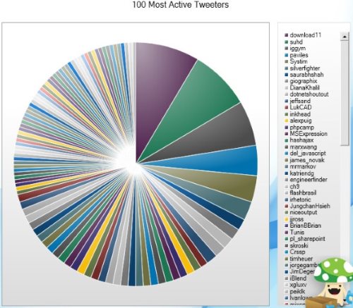
A pie chart with approximately a million slices of the same size and repeating colors. Need I say more?
 source-link
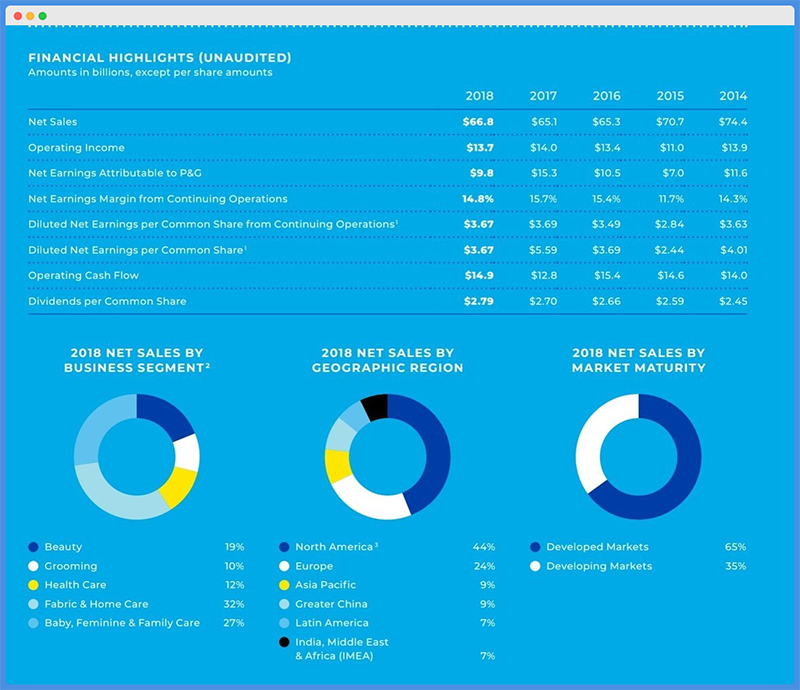
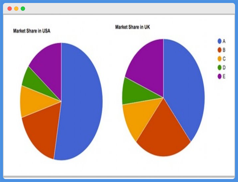
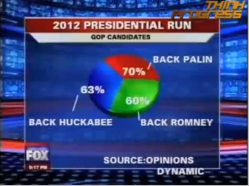
And again, a pie chart is always 100%, if it doesn't add up to 100%, it shouldn't be a pie chart. And if it does add up to 100% it also should not be a pie chart.
 source-link
And again, a pie chart is always 100%, if it doesn't add up to 100%, it shouldn't be a pie chart. And if it does add up to 100% it also should not be a pie chart.
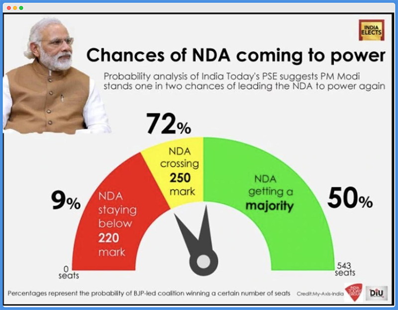
The bar length here is almost random, making the plot very misleading. And why the different hue here? A legend would be a good idea.
Nice informative axes are more than half of the success! ...or failure, as is in this case.
Sometimes the data is so simple that we don't need to visualise anything... unless we want to mislead...
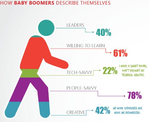
comparing angles is difficult, especially when the difference between the groups is so very small.
 source-link
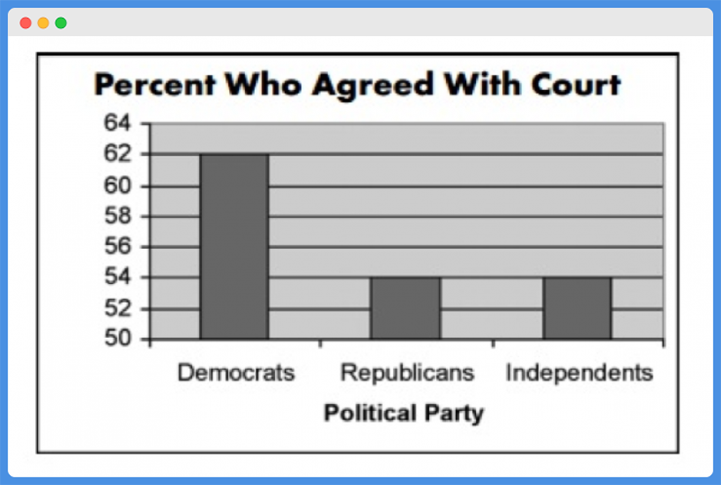
Ridicoulous and (in a different context) misleading. Y axis need to start from 0, and irregular objects instead of bars should be oly used after a very careful consideration.
A picture is worth a 1000 words. True, but sometimes you only need 10 words and no picture, as is the case here.
The problem here is that it takes a minute to notice that the y axis is upside down, so lower means more. This is counterintuitive and therefore difficult to interpret.
Another misleading visualisation. Sensible and clear axes are half of the success when visualising data.
 source-link
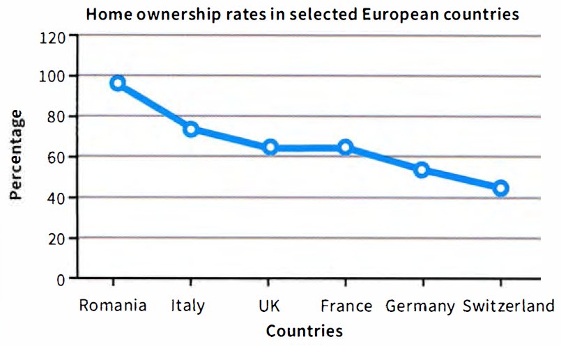
A graph should tell a story. Ideally a whole story, specific axis labels can help with this.
 source-link
A graph should tell a story. Ideally a whole story, specific axis labels can help with this.